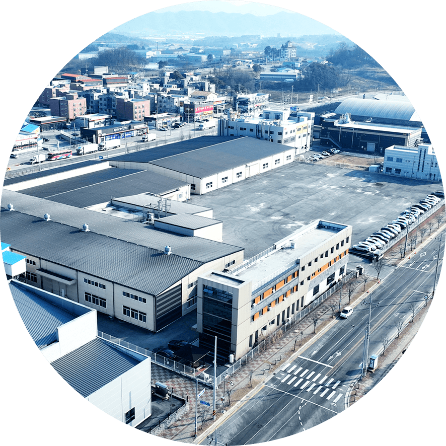
Introducing Taehwa G&G, which has been loved by consumers for over half a century.
SINCE 1972CORPORATE IDENTITY CI
Taehwa's determination is to become a global kitchen brand.
Since its founding, Taehwa G&G has continuously strived to contribute to the well-being of the nation and its people through the single industry of rubber gloves. With the mission of "contributing to the well-being of the nation and its people through rubber gloves," despite challenging conditions, we have steadily grown to become the leading manufacturer of high-quality products in this field in South Korea.
At this pivotal moment, as we strive to enhance our image as a globally advanced company, Taehwa G&G has transitioned to a corporate entity. We have also introduced a Corporate Identity (CI) initiative that is in line with contemporary trends. This includes the establishment of new symbols, logotypes, and color schemes, aiming to elevate our image as a leading company of the 21st century while reinforcing our traditional values of patriotism (애국), corporate loyalty (애사), and respect for people (애인). With the transition to a corporate entity and the newly established CIP, all our employees are committed to systematically and rationally leveraging these changes. We aim to create an enhanced image for Taehwa G&G and grow into a new, advanced company.
SY
SYMBOL
MBOL
Our CI is the most important visual element symbolizing Taehwa G&G. It plays a crucial role in our communication activities, forming the visual component of our corporate identity. The symbol of Taehwa G&G signifies: 1. Externally, our unwavering commitment to serving customers with high-quality products. 2. Internally, our proactive stance towards a clean, healthy lifestyle and environmental protection. 3. The spirit of patriotism (애국), corporate loyalty (애사), and respect for people (애인), promoting mutual trust and friendship and contributing to the company's healthy growth and the development of the local community and nation. To clearly and concisely convey these values, we have created the Taehwa logo and integrated it into a Word mark. The design motif is inspired by the clean waters of a lake, symbolizing our intentions.
Word Mark

Geometrical Construction
Basic form of Korean Word Mark
Basic form of English Word Mark
CO
COLOR
LOR
Colors are one of 3 basic elements that composes company’s image and play a vital role in shaping the image of Taehwa G&G through various visual media. Our primary color is "Taehwa Cerulean Blue," complemented by "Taehwa Compose Blue" and "Taehwa Permanent Green." These colors symbolize our commitment to a clean, healthy lifestyle and environmental protection, chosen to reflect a sophisticated and modern sensibility. Special attention should be paid to these colors’ brightness and saturation.

